The James Rose Center for Landscape Research and Design has released a call for entries for a design compettiont to explore "the aesthetics of landscape experience in the era of sustainability." The competition is focued on solutions to the ubiquitous small-lot, detached single-family, residential condition. Entries should employ sustainable strategies and tactics to create human landscape experiences that are beautiful, inspiring, perhaps profound; and which might serve as examples for transforming the suburban residential fabric.
This is a juried competetition open to all, including landscape architects, landscape designers, architects, individuals, teams, or firms. Submission deadline is April 16, 2010.
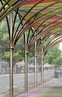
NYC adopts a new standard for urban construction sheds
We
posted an announcement last August for the "urbanSHED International Design Competition," and Young-Hwan Choi, a 28-year-old graduate student from the University of Pennsylvania, heeded the call* and won the $10,000 cash prize. So how about showing L+L a little love, wontcha, Young? A little sumpthin' sumpthin'... anything? No?
Mr. Choi's concept, the Urban Umbrella has been adopted by the New York City Department of Buildings as a new standard. While use of the design by contractors will not be mandatory, the Department reports that the installation costs are "in line" with the current standard and that long term maintenance and installations costs for the new structures will be lower. Also of note is that the new design will obstruct less of a building's facade which would appeal to building owners and affected businesses.
Steven Holl Architects, in collaboration with Glasgow-based JM Architects, has won by unanimous vote the international design competition for the new building of the Glasgow School of Art on the site opposite Charles Rennie Mackintosh's landmark building.
Though the competition was to find an architect-led team and not to select a design, the choice makes pefect sense given Holl's proficiency and interest in the use and expression of light in his work. It is a perfect match for Mackintosh's building which itself was groundbreaking for its push-pull typology of light.
"The Selection Committee considered that Steven Holl Architects' work showed a poetic use of light and their submission demonstrated a singular creative vision, scale of ambition, profound clarity and a respectful rivalry for the Mackintosh Building. The Committee believed that Holl's approach to the craft of building, his understanding of the opportunities of new technology and an enjoyment of the challenges of sustainable design, promised a great step forward in the development of architecture in an urban setting."
The building is composed studio volumes shaped by light and connected by a "circuit of connection" which encourages the creative contact central to the workings of the school.
Some have expressed dissapointment in the decision preferring a native architect for the job. However given the stature of the existing building, it is fitting that a global search procured a fitting match.
Link: Steven Holl Architects
One giant step for eco-friendly back to school gear
So you've got a kid, and you want to be "green," but let's face it, this is easier said than done. You have plastic this-and-that, one-use items, all of those school supplies, disposable lunch bags... etc., etc., etc. Sourcing environmentally responsible children's products is a royal pain!
What if one day your kid's tree-hugging school requires that you send waste-free lunches?! This is what happened to Renata Bodon who found it challenging to find safe and high-quality reusable lunch ware. Fortunately for you, Renata decided not only to solve her problem, but yours as well.
Meet One Small Step--your one stop shop offering a bevy of waste-free, lead-free, BPA-free, Phthalate-free, and PVC-free lunch and school supplies as well as items for babies and toddlers. And to top it off, One Small Step not only selects items with an eye for design, but also donates 10% of their gross returns to non-profits and partnering schools... you can even register your fave.
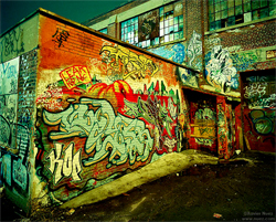
Photographer Xavier Nuez ventures late at night to places you are warned not to go, drawn to document bleak urban spaces. However, his photographs transcend the gloom and uncover the sublime; while some photos display an aura of foreboding, many reveal an uncanny sense of calm seemingly at odds with reality. Nuez offers a glimpse of his forays into these forbidding realms in the Alley Stories section of his website.
I've been chased by violent street gangs, accosted by crazed addicts and drug dealers, and have been held at gun point. If the police see me lurking in a dark alley, often I am questioned and searched. And yet under these trying conditions, and within the filth and stench of the city's gutters, I find inspiration. With a family history of homelessness and with a belief that I was next, I found the need to create monuments out of these shunned places.
Nuez uses three Hasselblad film cameras, two of which are more than 50-years old. To capture the vivid colors in his images, he shoots with battery-powered lights and colored gels that are combined with long exposures.
Xavier Nuez's photographs have been featured in solo and group exhibitions in museums and galleries throughout the United States and in Canada
Water Sports Center in Zahara de la Sierra, Cádiz, Spain
Spanish architect Julio Barreno Gutiérrez designed this boathouse just outside the small town of Zahara de la Sierra on the shore of the man-made lake, El Embalse de Zahara. The small structure serves as a boat storage facility and also houses changing rooms and restrooms for boaters, and is meant to be part of a larger recreation area in development.
While small and utilitarian, the structure responds elegantly to the native landscape, the high waterline of the resevoir, and the local vernacular of the "pueblo blanco" hillside town. The design was awared the 2008 Torres Key Prize by the College of Architects of Cádiz given every two years to honor the best new buildings in Cádiz. The architect describes the town "as a dense liquid falling down along the slope" and the small parcels and buildings along the shore as "small white pieces" scattered below; a green and white pixelated landscape.
Architect Julio Barreno Gutiérrez is an Associate Professor for the School of Architecture at the University of Seville.
We've admired the high quality kitchen systems designed by Seattle-based Henrybuilt for many years. Henrybuilt offers an American alternative to the sleek European kitchen systems we drool over.
The latest expansion to the line--the Workspace Component Group--builds on their well conceived backsplash panel system adding smart functionality. The components are a set of sculpted functional blocks: a cutting board, colander, and knife block. Like the existing accessories in the system, these components are designed to integrate with Henrybuilt's customizable backsplash panel system offering flexibility in configurations and changing needs. The colander and cutting board not only store neatly on the backsplash, but are designed to function with Henrybuilt's recessed countertop sink and drainboard.
"From its extraction through sale, use and disposal, all the stuff in our lives affects communities at home and abroad, yet most of this is hidden from view. The Story of Stuff is a 20-minute, fast-paced, fact-filled look at the underside of our production and consumption patterns. The Story of Stuff exposes the connections between a huge number of environmental and social issues, and calls us together to create a more sustainable and just world. It'll teach you something, it'll make you laugh, and it just may change the way you look at all the stuff in your life forever."
It is a work in progress with many more place marks to come... yup, there are lots of holes in our map. But eventually no matter where you find yourself in the world, L+L will have your back. A lofty goal perhaps, but that's how we roll. Oh yeah, and you'll see embedded maps accompanying many of our posts from here on out--not to mention the maps we've added to archived posts as well--so you can see where stuff is located, and what's around it.
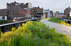
Section 1 of the High Line (from Gansevoort Street to 20th Street) opened today: Tuesday, June 9, 2009.
This fact is nearly a miracle when you consider not only the idea of turning an abandoned New York City elevated railway into a public park and all of the hurdles involved to make it possible, but it is especially amazing that the project was built to such a high quality of design and execution.
The design, inspired by the melancholic, found beauty of this postindustrial ruin which was reclaimed by nature, is led by landscape architect James Corner Field Operations, with Diller Scofidio + Renfro Architects. The landscape is designed by Field Operations with the consultation of the master Dutch planting designer Piet Oudolf. The reinterpretation of this urban relic imagined by James Corner Field Operations and the design team is a brilliant blend of preservation, innovation, conservation, restoration, and orignal modern design.
A tired San Francisco Victorian duplex is transformed by Oakland firm Envelope Architecture + Design in collaboration with owner and interior designer Claire Bigbie and landscape designer Flora Grubb.
Claire, a RISD trained designer, purchased this Noe Valley duplex in 2005 with her partner Jay Shapiro after returning to the US from London (where she worked for the hip interior design studio Precious McBane) to take a position as the style editor for ReadyMade Magazine. The house was in need of serious renovation, and the resulting project transformed the typical series of dark, cellular rooms into contemporary live/work spaces which respects the existing historic fabric while re-imagining the altered structure. Three days after Claire and Jay moved in, Claire began consulting on projects with Envelope A+D where she now leads the interiors component of the collaborative design process.
This landmark building in Oslo by Snøhetta (Kjetil Trædal Thorsen, Tarald Lundevall, Craig Dykers) is the
largest cultural centre built in Norway in 700 years. The competion brief stated that the operahouse should be monumental in it’s expression. Snøhetta's interpretation of monumentality is a concept of togetherness, joint ownership, easy and open access for all which is manifested in the warping roof plane making the an extended piece of civic public space. Monumentality is achieved through wide horizontal extension and not verticality. Integral to the 1,000-room interior, which is largely lined with crafted woodwork (using the traditions of Norwegian boat builders), are a number of art commissions interwoven into the structural fabric, including a cloakroom, a collaboration with their 2007 Serpentine Pavilion collaborator Olafur Eliasson.
The European Commission and the Fundació Mies van der Rohe announced today that the Norwegian National Opera & Ballet, Oslo, Norway by Snøhetta is the winner of the European Union Prize for Contemporary Architecture – Mies van der Rohe Award 2009.
Audio: A discussion with Frank Gehry and Architecture for Humanity’s Cameron Sinclair.
Will an architecture of "excess" will be replaced by one of "relevance?" Frances Anderton talks to Cameron Sinclair (Co-founder of Architecture for Humanity) and Frank Gehry. Listen below:
Emeco and Frank Gehry, together again... for a cause
Emeco and Frank Gehry have collaborated in the development a one-of-a-kind large scale bench which will be presented during the Salone del Mobile in Milan, April 22-27 2009. If you want it, you won't be able to just place your order with DWR... Tuyomyo is a unique piece which will be auctioned in December, 2009. Funds raised will go towards the creation a million dollar fund called, Leslie Gehry Brenner Award, to honor Frank’s late daughter in support of the work of the Hereditary Disease Foundation.
For the design, Gehry’s mandate was simple, "The form has to be free and light. It must be structural, and at the same time poetic. And a little dangerous." And indeed it is... the project was truly an experiment pushing the boundaries of aluminum fabrication and paving the way for possible new products. The bench measures 3 meters long, weighs 122 pounds, and is composed of 80% recycled aluminum formed using aircraft manufacturing technology.
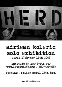
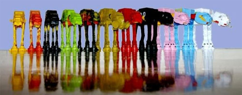
HERD is the first solo outing by Edmonton-based designer and L+L friend Adriean Koleric (aka ITEM). The exhibit is the first in a series that will be focusing on early 80's Western Pop Culture and it's enduring influence on today's Designers and Artists.
The installation features the original Star Wars AT-AT (Imperial Walker) designs from The Empire Strikes Back in numerous mediums. The main component is a series of twelve customized AT-AT models. Koleric is interested in architecture and industrial design and how both are influenced by popular culture and nostalgia.
The exhibit opens, April 17th, at Latitude 53 in Edmonton, Alberta, Canada, and runs through May 16th. Congrats, Adriean!
Peter Zumthor of Switzerland has been chosen as the 2009
Laureate of the Pritzker Architecture Prize. The Zumthor choice marks the second time in three decades of the Pritzker
Architecture Prize that Switzerland has provided the laureate. In 2001, Jacques Herzog and Pierre de Meuron were the honorees.
In Zumthor’s own words as expressed in his book, Thinking Architecture:
I believe that architecture today needs to reflect on the tasks and possibilities which are inherently its own. Architecture is not a vehicle or a symbol for things that do not belong to its essence. In a society that celebrates the inessential, architecture can put up a resistance, counteract the waste of forms and meanings, and speak its own language. I believe that the language of architecture is not a question of a specific style. Every building is built for a specific use in a specific place and for a specific society. My buildings try to answer the questions that emerge from these simple facts as precisely and critically as they can.
The formal ceremony for what has come to be known throughout the world as architecture’s highest honor will be held on May 29 in Buenos Aires, Argentina.
The exhibition, running at MoMA in New York City from April 8, 2009–September 14, 2009, draws from the rich collection of The Museum of Modern Art to examine the diverse attitudes toward landscape over the last hundred years.
I saw a sneak peak of the exhibit before it opened a couple of weeks ago, and what I saw left me wanting to see more. Featured designers include Roberto Burle Marx, Frank Lloyd Wright, Hans Hollein, Diller + Scofidio, Tadao Ando, Mies van der Rohe, Bernard Tschumi, Enric Miralles, and many more.
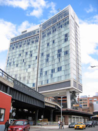
The Polshek Partnership's High Line hurdling hotel
It's been around the blogosphere for a while... and we've mused on the nice lap dance it gives the High Line park. But in a striking bit of coincidence, I just recently had the opportunity to see The Standard with my own eyes, and NY Time critic Nicolai Ouroussoff has reviewed it. So I'm inspired to post a nice, old-fashioned bit of archiporn... yes, lots of pictures after the jump. But I'll keep writing so you can say you read the articles.
Sure, it's a bit over-the-top and extravagant in the face of our current economic woes, but why not wax a bit nostalgic... nay... optimistic for the good days to come. Heck, the hotel hasn't even been completed! And neither is the aforementioned elevated park. So, I suppose we're looking to the future.
This massive mixed-use complex was constructed on the remains of a hillside whose earth had been used for a huge landfill project for the Osaka Bay area. The design reconstructs the landscape that had been destroyed but also, through the idea of rebirth and reconstruction, serves as a memorial to the thousands who had lost their lives and the destruction of land in the massive earthquake that shook the Kobe region in 1995. The complex is vast in scale, yet the design manages capture the small quiet moments for which Ando is known.
This video was created as part of Jonathan Jarvis's thesis work in the Media Design Program at the Art Center College of Design in Pasadena, California.
I'm totally sick of the pervasive references to the economy in the media and advertisements, but this is worth a look.
A very nice indoor vertical garden designed for a space without irrigation or drainage at the platinum LEED certified Bardessono hotel in Yountville, California.
The simple solution uses airplants (Tillandsia, members of the Bromeliad family) attached to metal rods which protrude from the wall. The visual effect of hundreds of Tillandsia "floating" within these alcoves is striking. And while some of the plants will need to be changed out occasionally, it is a much more sustainable solution than the typical hotel lobby floral display.
More than two years ago, I read an article by LA based journalist Sam Kaplan talking about what he called "woonerfern," a Dutch concept of street design which blurs the boundaries of traffic separation and use. However a quick web search for "Woonerfern" will turn up nothing other than references to this article by Mr. Kaplan, and using a Dutch-to-English dictionary was no help either. A bit more research, and AH-HA! I discovered the term "Woonerf" (or the plural "Woonerven"), a concept developed in the late 1960's and early 70's which is credited to the late Dutch civil engineer Hans Monderman, who's philosophy of road design throws out the conventional wisdom that driving and walking are incompatible and that traffic must be directed and controlled by signals and signage.
The concept has evolved into numerous variations of philosophy: Home Zones, Shared Space, Living Streets, New Mobility, etc. But never mind what it is called, the concept of a street serving multiple functions is an interesting one. It expands the possibilities of walkable, sustainable cities which accommodates the automobile, but emphasizes and encourages alternate modes of movement and inhabitation of the street-scape--linear public space. Plus, it is just a good era to revisit 'infrastructure' rather than, say, sexy modern mountain vacation homes. So, let's take a look at shared spaces, shall we?
Link: Salon - Why don't we do it in the road?
Link: NY Times - A Path to Road Safety With No Signposts
Link: Wired - Roads Gone Wild
The new animated logo of The Cooper Union makes me go "hmmmm"
In the world of graphic design, there is perhaps no more basic, yet simultaneously complex design problem than the logo. A logo (or logotype) is ultimately an identifying symbol; the visual marker for a brand. But what are the elements of a great logo? Traditionally, a "good" logo should meet some basic criteria, and there are countless rules of thumb by countless designers, but these four basics described by designer David Dairey are how I have always thought of what makes a good logo: it is describable, memorable, effective without color, and scalable.
There are also countless examples of logos which do not meet these criteria, most are cringe inducing. But in this digital age, there are examples of logos which are designed to inhabit the confines of digital space; and the confines are, well, much less confining. The new logo for The Cooper Union is perhaps the best example of this trend. It is elemental and basic, yet describes the complex of the institution it represents (view: full animation, website intro version). It meets the first two criterial of basic logo design, it does not meet the third, and I think it is questionable on the fourth.
But most notably, it is clear that this logo was designed for digital space; it relies on movement to fully reveal its meaning. While I like the design, I wonder how this logo can function for the institution when it comes to the (current) necessity of static use. And in general, what does this mean in the world of identity design?
How to restore your vintage fiberglass shell furniture. The right way.
I have six original Eames shell chairs which I picked up at a garage sale four years ago. Ever since (with much procrastination in between, of course) I have been trying to figure out how to restore the fiberglass which has lost its luster... and let me tell you, there is a lot of bad advice out there on the 'innerwebs' (ahem, AT). So I was very glad to find Chairfag. As of today, this is the one and only post on Chairfag. We hope that there will be more in the future! Because... yeah, I'll admit it... I'm a little bit gay for chairs.
The first half of the article doesn't apply for my chairs though it is educational. The basic shell restoration info towards the end is pure gold. And the best part is: it's easy! Get to work!
Okey dokey, very quiet around here for CA Boom time of year... yes we are usually buzzing with activity. Alas, not this time. We will have some stuff to share with y'all later, buy you'll just have to wait. In the mean time, here are some links to tide you over:
LA Times was there, and they were snapping pictures:
I warned you way back in September, and now CA Boom is almost here... before you know it CA Boom will be all up in your grill, so get the lead out and make your plans today. I mean right now, because you dear Land+Living readers have been extended a whopping $4 discount for purchasing tickets in advance; enter discount code "land" when you register online and if the discount isn't incentive enough, just think about the headaches you will save your self by being able to walk right in.


 We
We  Steven Holl Architects, in collaboration with Glasgow-based JM Architects, has won by unanimous vote the international design competition for the new building of the Glasgow School of Art on the site opposite Charles Rennie Mackintosh's landmark building.
Though the competition was to find an architect-led team and not to select a design, the choice makes pefect sense given Holl's proficiency and interest in the use and expression of light in his work. It is a perfect match for Mackintosh's building which itself was groundbreaking for its push-pull typology of light.
"The Selection Committee considered that Steven Holl Architects' work showed a poetic use of light and their submission demonstrated a singular creative vision, scale of ambition, profound clarity and a respectful rivalry for the Mackintosh Building. The Committee believed that Holl's approach to the craft of building, his understanding of the opportunities of new technology and an enjoyment of the challenges of sustainable design, promised a great step forward in the development of architecture in an urban setting."
The building is composed studio volumes shaped by light and connected by a "circuit of connection" which encourages the creative contact central to the workings of the school.
Some have expressed dissapointment in the decision preferring a native architect for the job. However given the stature of the existing building, it is fitting that a global search procured a fitting match.
Link:
Steven Holl Architects, in collaboration with Glasgow-based JM Architects, has won by unanimous vote the international design competition for the new building of the Glasgow School of Art on the site opposite Charles Rennie Mackintosh's landmark building.
Though the competition was to find an architect-led team and not to select a design, the choice makes pefect sense given Holl's proficiency and interest in the use and expression of light in his work. It is a perfect match for Mackintosh's building which itself was groundbreaking for its push-pull typology of light.
"The Selection Committee considered that Steven Holl Architects' work showed a poetic use of light and their submission demonstrated a singular creative vision, scale of ambition, profound clarity and a respectful rivalry for the Mackintosh Building. The Committee believed that Holl's approach to the craft of building, his understanding of the opportunities of new technology and an enjoyment of the challenges of sustainable design, promised a great step forward in the development of architecture in an urban setting."
The building is composed studio volumes shaped by light and connected by a "circuit of connection" which encourages the creative contact central to the workings of the school.
Some have expressed dissapointment in the decision preferring a native architect for the job. However given the stature of the existing building, it is fitting that a global search procured a fitting match.
Link:  So you've got a kid, and you want to be "green," but let's face it, this is easier said than done. You have plastic this-and-that, one-use items, all of those school supplies, disposable lunch bags... etc., etc., etc. Sourcing environmentally responsible children's products is a royal pain!
 Photographer Xavier Nuez ventures late at night to places you are warned not to go, drawn to document bleak urban spaces. However, his photographs transcend the gloom and uncover the sublime; while some photos display an aura of foreboding, many reveal an uncanny sense of calm seemingly at odds with reality. Nuez offers a glimpse of his forays into these forbidding realms in the
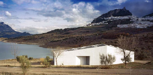

 Section 1 of the High Line (from Gansevoort Street to 20th Street) opened today: Tuesday, June 9, 2009.
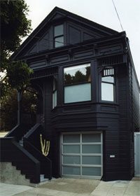 A tired San Francisco Victorian duplex is transformed by Oakland firm Envelope Architecture + Design in collaboration with owner and interior designer Claire Bigbie and landscape designer Flora Grubb.
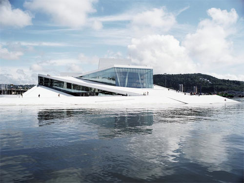
 Link:
Link: 
 HERD is the first solo outing by Edmonton-based designer and L+L friend Adriean Koleric (aka ITEM). The exhibit is the first in a series that will be focusing on early 80's Western Pop Culture and it's enduring influence on today's Designers and Artists.
 It's been around the blogosphere for a while... and we've mused on the nice lap dance it gives the
 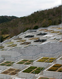 This massive mixed-use complex was constructed on the remains of a hillside whose earth had been used for a huge landfill project for the Osaka Bay area. The design reconstructs the landscape that had been destroyed but also, through the idea of rebirth and reconstruction, serves as a memorial to the thousands who had lost their lives and the destruction of land in the massive earthquake that shook the Kobe region in 1995. The complex is vast in scale, yet the design manages capture the small quiet moments for which Ando is known.
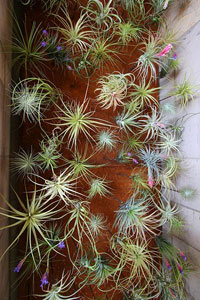 A very nice indoor vertical garden designed for a space without irrigation or drainage at the platinum LEED certified Bardessono hotel in Yountville, California.
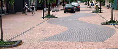

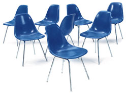 I have six original Eames shell chairs which I picked up at a garage sale four years ago. Ever since (with much procrastination in between, of course) I have been trying to figure out how to restore the fiberglass which has lost its luster... and let me tell you, there is a lot of bad advice out there on the 'innerwebs' (ahem,