This video was created as part of Jonathan Jarvis's thesis work in the Media Design Program at the Art Center College of Design in Pasadena, California.
I'm totally sick of the pervasive references to the economy in the media and advertisements, but this is worth a look.
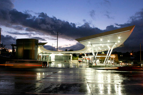
After years of chatter around the blogoshpere, Kanner Architects' unique gas station on Slauson and LaBrea in Los Angeles finally opens for business. At least that is what our sources tell us...
Aaaand... we are still not able to get this bit of insider information up on the web before a certain someone else did earlier today. Oy vey! So rather than telling you about all the delays, the praise and criticism, the Dutch seamless flooring, Spanish glass tile, monstrous curved channel glass, and massive amount of beautifully crafted stainless steel that was used in this project, we will just provide you with some eye candy recently taken on site. You be the judge...
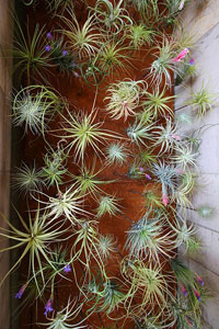
A very nice indoor vertical garden designed for a space without irrigation or drainage at the platinum LEED certified Bardessono hotel in Yountville, California.
The simple solution uses airplants (Tillandsia, members of the Bromeliad family) attached to metal rods which protrude from the wall. The visual effect of hundreds of Tillandsia "floating" within these alcoves is striking. And while some of the plants will need to be changed out occasionally, it is a much more sustainable solution than the typical hotel lobby floral display.
More than two years ago, I read an article by LA based journalist Sam Kaplan talking about what he called "woonerfern," a Dutch concept of street design which blurs the boundaries of traffic separation and use. However a quick web search for "Woonerfern" will turn up nothing other than references to this article by Mr. Kaplan, and using a Dutch-to-English dictionary was no help either. A bit more research, and AH-HA! I discovered the term "Woonerf" (or the plural "Woonerven"), a concept developed in the late 1960's and early 70's which is credited to the late Dutch civil engineer Hans Monderman, who's philosophy of road design throws out the conventional wisdom that driving and walking are incompatible and that traffic must be directed and controlled by signals and signage.
The concept has evolved into numerous variations of philosophy: Home Zones, Shared Space, Living Streets, New Mobility, etc. But never mind what it is called, the concept of a street serving multiple functions is an interesting one. It expands the possibilities of walkable, sustainable cities which accommodates the automobile, but emphasizes and encourages alternate modes of movement and inhabitation of the street-scape--linear public space. Plus, it is just a good era to revisit 'infrastructure' rather than, say, sexy modern mountain vacation homes. So, let's take a look at shared spaces, shall we?
Link: Salon - Why don't we do it in the road?
Link: NY Times - A Path to Road Safety With No Signposts
Link: Wired - Roads Gone Wild
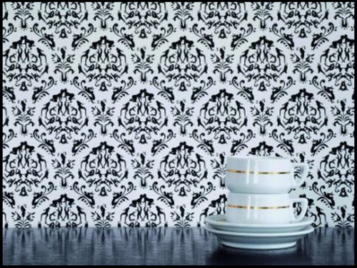
Perfect for Valentine's Day, Atelier Blink's 2006 wallpaper, Rendezvous, draws on inspiration from grandma's wallpaper of days past, but with a Kamasutra twist.
Link: Atelier Blink
Link: Vlaemsch()
The new animated logo of The Cooper Union makes me go "hmmmm"
In the world of graphic design, there is perhaps no more basic, yet simultaneously complex design problem than the logo. A logo (or logotype) is ultimately an identifying symbol; the visual marker for a brand. But what are the elements of a great logo? Traditionally, a "good" logo should meet some basic criteria, and there are countless rules of thumb by countless designers, but these four basics described by designer David Dairey are how I have always thought of what makes a good logo: it is describable, memorable, effective without color, and scalable.
There are also countless examples of logos which do not meet these criteria, most are cringe inducing. But in this digital age, there are examples of logos which are designed to inhabit the confines of digital space; and the confines are, well, much less confining. The new logo for The Cooper Union is perhaps the best example of this trend. It is elemental and basic, yet describes the complex of the institution it represents (view: full animation, website intro version). It meets the first two criterial of basic logo design, it does not meet the third, and I think it is questionable on the fourth.
But most notably, it is clear that this logo was designed for digital space; it relies on movement to fully reveal its meaning. While I like the design, I wonder how this logo can function for the institution when it comes to the (current) necessity of static use. And in general, what does this mean in the world of identity design?
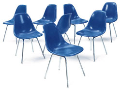
How to restore your vintage fiberglass shell furniture. The right way.
I have six original Eames shell chairs which I picked up at a garage sale four years ago. Ever since (with much procrastination in between, of course) I have been trying to figure out how to restore the fiberglass which has lost its luster... and let me tell you, there is a lot of bad advice out there on the 'innerwebs' (ahem, AT). So I was very glad to find Chairfag. As of today, this is the one and only post on Chairfag. We hope that there will be more in the future! Because... yeah, I'll admit it... I'm a little bit gay for chairs.
The first half of the article doesn't apply for my chairs though it is educational. The basic shell restoration info towards the end is pure gold. And the best part is: it's easy! Get to work!
We've featured a few articles about MR+A's work in the past, from furniture to prefab, so I was pretty stoked to open the mailbox today and find a copy of Princeton Architectural Press' recent book, Marmol Radziner + Associates: Between Architecture and Construction. Published in July 2008, this book runs the gamut of MR+A's work. Beginning with the "Early Years", the book highlights some of the witty quotes placed on their office marquee then quickly jumps into many of their most well-known projects including the Kaufmann House restoration, the Harris Pool House, the TBWA/Chiat/Day offices in San Francisco, and the Glenncoe Residence.
In addition to the firm's commercial and residential work, there is also a section showcasing their furniture work and the design decisions that went into creating their Glenncoe furniture line.
Overall, this is a well designed book that truly captures the creativity and uniqueness of MR+A. Definitely give it a look the next time you're at your local bookseller.
Antony Gormley's iron men installation has found a permanent home on Crosby Beach, Liverpool
Intrigued by the work of Gormley, I went to visit Crosby beach and its new permanent residents [100 of them along a 2mile stretch] few weeks ago with a good friend of mine, for a bit of sunshine and a bit of photography.
Walking on the beach amidst this iron men crowd, it feels they are another part of us, the permanent element of our existence which keeps looking on for questions and answers. You feel compelled to stand side to them and look forward, trying to understand, to visualise what it is they are waiting for, or what it is that they are trying to make us see.
In fact, Day 3 went by so fast that we missed one of the houses on the tour... Oy vey! We did walk through the other four examples of nouveau LA living, and there is plenty to observe and say about these abodes.
A new "paperless" architecture book featuring facades from around the world.
This book is the result of two years of architectural research. Dynamic facades, ventilated, high-tech or traditional composites with new features. This book shows that currently new skins not only act as an isolating element, besides interact with the environment, optimizing energy exchange with the outside. From Germany to Australia or Korea to Colombia, there are many examples that readers can visit with this publication. With international vocation due to bilingual English-Spanish text and a language away from technicalities, this paper aims to show as an "interactive toy" the evolving field of the facades in architecture.
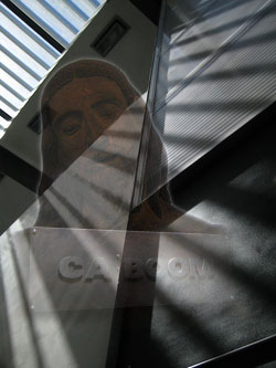
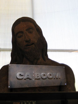
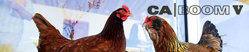
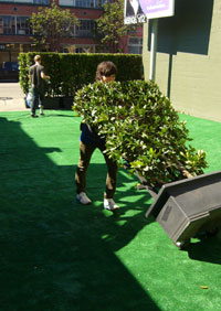
CA Boom V Saturday filled with familiar faces... and some cool houses.
Has the suspense gotten to you yet? At long last, we put you out of your misery. And the bling was worth the wait... lots of picture galleries for you modern home loving peops.
Day 2 of the guided home tour takes us around West Los Angeles and it feels sorta like homecoming. It just so happens that Neil Denari, Chris Genik and Kevin Daly all instructed some of us at SCI-Arc years ago, and nothing like getting those boys back for the countless sleepless nights they made us spend cutting basswood and atomizing onto mylar we say, so let’s have at it.
Featuring the work of Thomas Campbell, Shepard Fairey, Ed Templeton, Barry McGee and others, Beautiful Losers highlights how these artists, with almost no influence from the established art world, have been transforming pop culture.
Link: Beautiful Losers
Via: 70percent.org
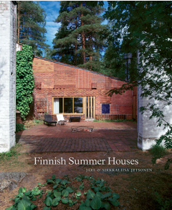
One of our most popular posts here at L+L is the Finland Summer House posted by James back in January 2005. If exploring summer houses in Finland is your raison d'être, then we have a book for you. Finnish Summer Houses by Jari & Sirkkaliisa Jetsonen is a new book from Princeton Architectural Press that showcases work from architects such as Eliel Saarinen, Alvar Aalto, Juhani Pallasmaa and many others.
Architectural styles featured in the book run the gamut from farmhouse villas of the late 1800's to the modern structures of today.
CA Boom V follows in a tradition of providing sensory overload to design professionals and aficionados alike (hint: the architects are normally the tired looking folk, since the wardrobe no longer reveals anything apparently), and this edition did not let anyone down in that respect.
Unfortunately for us (and for you), we were unable to go on the architecture tour on Friday, so there is no coverage of that excursion.
Fret not, since we provide you with links to all the architecture offices involved (after the jump). You will have to imagine our witty banter and myopic architectural insight when perusing the web sites of the participating architects, but, let’s face it, you like the pictures best anyway.
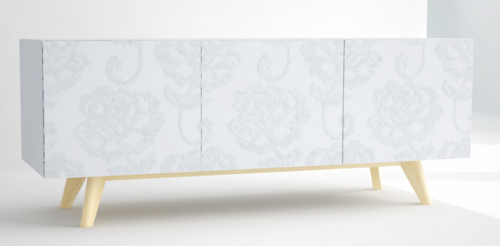
DecodeLondon is a new and innovative British design and manufacturing company committed to working with London's best creative talent. The Textile Side Unit, designed by Jethro Macey and featured above in Floral, is crafted using CNC milled stone composite doors and a solid oak base.
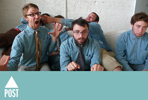
Chicago collective The Post Family recently wrapped up a showing last month over at Letterform. Served as an unofficial retrospective of the groups work, the exhibit had displayed everything from screen print and letterpress work to post-it note and found object installation as well as photography.
Okey dokey, very quiet around here for CA Boom time of year... yes we are usually buzzing with activity. Alas, not this time. We will have some stuff to share with y'all later, buy you'll just have to wait. In the mean time, here are some links to tide you over:
LA Times was there, and they were snapping pictures:
I warned you way back in September, and now CA Boom is almost here... before you know it CA Boom will be all up in your grill, so get the lead out and make your plans today. I mean right now, because you dear Land+Living readers have been extended a whopping $4 discount for purchasing tickets in advance; enter discount code "land" when you register online and if the discount isn't incentive enough, just think about the headaches you will save your self by being able to walk right in.
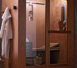
Ideal Standard's new Tris Sauna-cum-Steam-cum-Shower Room is a dream come true. The only downside? The price tag!
While working on a private house for a client, I have been researching into steam/shower rooms and to my delight I have been coming across some fantastic work by product designers alike.
Tris by Ideal Standard in particular has caught my attention (and the client's too!)
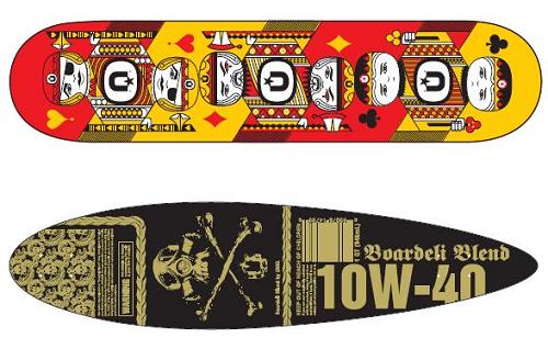
UNKLBRAND has ventured into the longboard realm with their upcoming mini-series via Boardeli. Each deck will be produced at a low, low run of 4! Pre-sale hits March 1st.
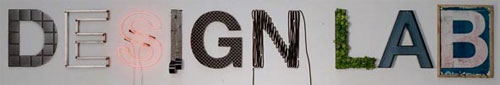
Design Lab 2008 challenge: Design Home Appliances for the Internet generation
Electrolux Design Lab, established in 2003, is an annual global design competition open to undergraduate and graduate industrial design students who are invited to present innovative, daring ideas and solutions for home appliances.
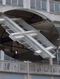
The Sculptor Richard Wilson's installation in Liverpool takes by surprise every passer by!
Richard Wilson is regarded as one of the most influential artist/sculptor of the 21st century. English born, he initially trained as a graphic designer but half way through his degree his switched to a Fine Art degree as he realised he was a ‘maker’.
After completion of his academic studies, Wilson returned to London and set base in Butlers Wharf till the early 80’s.
Richard Wilson has always been interested in the relationship between architectural spaces and the changes that can be applied to them, either by people’s interaction, or by the maker or by the manipulation of perception.
One of his most famous pieces, that brought him to be recognized worldwide, is 20:50, which is now permanently exhibited at the Saatchi Gallery in London.
The United States Postal Service is giving Charles and Ray Eames (and some of their designs) some face time on your mail.
The set of sixteen stamps designed by Derry Noyes (wow... you can make a living as a stamp designer?!!?) showcases the broad range of work for which the design duo are known. Coming next summer.
Art inspired by landscape architecture and design | 10/06/07
A bit late to say the least, but let's start the New Year off right by provided a wrap up of Cultivated, an exhibition held in conjunction with the annual ASLA conference in San Francisco back in October.
The Event was a great success, only minutes after Mars Bar opened its doors, the space was filled with the buzz of local artists, landscape architects and designers. String lights lined the sod-covered sidewalk directing the incoming flow through the doors where they were presented with a layout of the exhibits and a schedule for the media show. People meandered through the Front Gallery to explore the art work ranging from photography portraying the American Landscape in Bryan Schutmaat's eyes, poetic mixed media works from local Designer Zach Tanner, and Landscape Architect Christian Lemon's sculptural work constructed from bamboo, wood burl and Japanese maple.
When I first received word about the Bent Plywood Cat Scratcher, my belief that bent ply had jumped the shark was somewhat reinforced. I mean, you can pretty much find a bent ply something-or-other just about everywhere these days. So, I ran this by a cat person, who also happens to have some modern tastes, and she thought it was a great idea. She quickly reminded me of those shag-carpet "cat condo" scratching towers down at the local PetSmart and upon hearing that, I was sold on the idea of this scratcher.
The scratcher appears to be available only in walnut but the cool thing about this is your carpet options are endless. The scratcher is sized to accommodate FLOR carpet tiles, allowing you to change it's appearance on a whim.
Take the time today and get to know Chad, Rod, Alex, Scott, David and Sam. Otherwise known as Chicago's favorite brothers from different mothers, The Post Family.
Apart from having strong individual portfolios, the group has quietly put together a solid blog with posts consisting of quirky designs as well as some brilliant examples of contemporary art.
Everything is for the growth of our family members and community by supplying them with the resources and inspiration to accomplish their individual goals.
Words from Alex Post on Values:
Essentially, I value value. Currency, measurable amounts of wealth and gold. Value is tangible. Value allows me to purchase cars and gain respect from peers and even distinguished individuals above me on the food chain. I will never underestimate the power of value and it’s ability to buy small countries and even portable underarm hygenic products.
I wonder if they'd be willing to adopt a Post cousin from Canada?


 A very nice indoor vertical garden designed for a space without irrigation or drainage at the platinum LEED certified Bardessono hotel in Yountville, California.
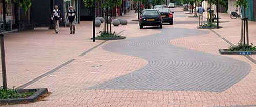
 Perfect for Valentine's Day, Atelier Blink's 2006 wallpaper, Rendezvous, draws on inspiration from grandma's wallpaper of days past, but with a Kamasutra twist.

 I have six original Eames shell chairs which I picked up at a garage sale four years ago. Ever since (with much procrastination in between, of course) I have been trying to figure out how to restore the fiberglass which has lost its luster... and let me tell you, there is a lot of bad advice out there on the 'innerwebs' (ahem,
 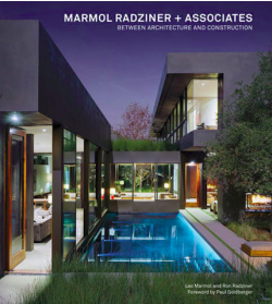 We've featured
 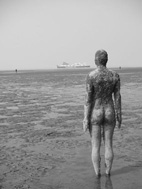 Intrigued by the work of Gormley, I went to visit Crosby beach and its new permanent residents [100 of them along a 2mile stretch] few weeks ago with a good friend of mine, for a bit of sunshine and a bit of photography.
 Woah... that was fast...
 Has the suspense gotten to you yet? At long last, we put you out of your misery. And the bling was worth the wait... lots of picture galleries for you modern home loving peops.
 One of our most popular posts here at L+L is the
  CA Boom V follows in a tradition of providing sensory overload to design professionals and aficionados alike (hint: the architects are normally the tired looking folk, since the wardrobe no longer reveals anything apparently), and this edition did not let anyone down in that respect.


 Ideal Standard's new Tris Sauna-cum-Steam-cum-Shower Room is a dream come true. The only downside? The price tag!
 Richard Wilson is regarded as one of the most influential artist/sculptor of the 21st century. English born, he initially trained as a graphic designer but half way through his degree his switched to a Fine Art degree as he realised he was a ‘maker’.
After completion of his academic studies, Wilson returned to London and set base in Butlers Wharf till the early 80’s.
Richard Wilson is regarded as one of the most influential artist/sculptor of the 21st century. English born, he initially trained as a graphic designer but half way through his degree his switched to a Fine Art degree as he realised he was a ‘maker’.
After completion of his academic studies, Wilson returned to London and set base in Butlers Wharf till the early 80’s. 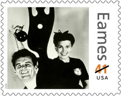 The United States Postal Service is giving Charles and Ray Eames (and some of their designs) some face time on your mail.
 A bit late to say the least, but let's start the New Year off right by provided a wrap up of Cultivated, an exhibition held in conjunction with the annual ASLA conference in San Francisco back in October.
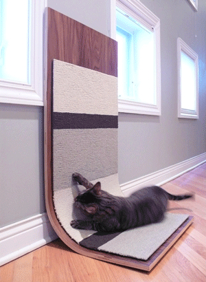 When I first received word about the Bent Plywood Cat Scratcher, my belief that bent ply had jumped the shark was somewhat reinforced. I mean, you can pretty much find a bent ply something-or-other just about everywhere these days. So, I ran this by a cat person, who also happens to have some modern tastes, and she thought it was a great idea. She quickly reminded me of those shag-carpet "cat condo" scratching towers down at the local PetSmart and upon hearing that, I was sold on the idea of this scratcher.