MOST COMMENTED
Susan Saarinen, daughter of famed architect Eero Saarinen, finds her creative outlet in landscape architecture
She grew up surrounded by artists and modern design masters; her mother was a sculptor, her father and grandfather were famed architects Eero and Eliel Saarinen, and her godfather was Charles Eames. Art and design have truly been part of her everyday life.
"At dinner every night, we had discussions about art or design in some form," she says. "It was a very rich environment in terms of art and design. I didn't know until much, much later how much I picked up by osmosis."
After a series of career and life changes, Susan now runs a small landscape architecture practice in Golden, Colorado.
Link: Rocky Mountain News - Artist, designer by nature
Firm: Saarinen Landscape Architecture
First Annual Trade Fair and Festival of California Design in Santa Monica, August 12-15, 2004
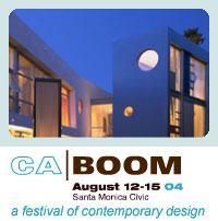 A three and a half day event, trade fair and festival combined into one for designers and consumers. The festival will include exhibitions on design, prefab, architecture, landscape and furniture as well as home tours, speakers, bands and DJs, restaurants and lounges.
CA Boom is coming up soon! Don't forget to register early for discounted admission.
Link: CA BOOM
UPDATE:
Report: CA Boom Opens!
Report: CA Boom - Day 1
Report: CA Boom - Day 2
Report: CA Boom - Day 3
Report: CA Boom Wrap Up
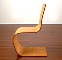
Topographically inspired chair
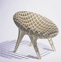 Designed by Mark Naden of Toda, a New York based multidisciplinary design office, the Topos Chair was designed to create a three dimensional form out of a two dimensional material. The result is a grid of contoured Finnish birch plywood with maple veneer that contours to the body.
Designer: Toda - Mark Naden
Manufacturer: Malofancon
Link: Exterior : Interior
Cleanse your psychophysical well-being.
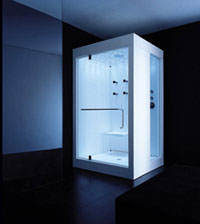 We're not quite sure what to make of this other than it appears to be a KOS Kosmic shower enclosure that lights up in different colors depending on what your mood and/or state of being requires.
"Every colour has a specific beneficial effect on psychophysical well-being. Form and function are combined to offer something that is truly new. Having a bath will be a really pleasant experience that is combined with the genuine benefits of chromotherapy. At this very moment, someone in the world is undressing, turning off the light...preparing to have a bath. Idrocolore by Kos fot total chromotherapy and blower massage, offers true well-being."
Regardless, it's quite the tub.
Link: KOS
Photographer and graphic designer.
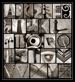 Recently while browsing the web for new prints, I came across the gallery of Abba Richman. I was drawn to many of Abba's prints, primarly because of his composition and how he captures the bold colors of many objects that we see, and perhaps ignore, everyday. His "Alphabet Series" (featured at right) is a wonderful photo essay using common everyday items to recreate the alphabet.
"There is nothing to be invented in our visual world, it's all there. I shy away from photographing glorious sunsets, flowers, animals and beautiful things (or people). I find myself again and again looking at ordinary everyday objects, at garbage, old things, discarded junk, stuff lying around and at the man in the street; looking at things really close up and trying to find beauty in their colour and form. Sometimes I find that beauty, more often I don't. Now and then I am satisfied with what I have photographed, occasionally very satisfied and sometimes... well, I just start again and continue looking."
Link: Abba Richman
Bentwood Bamboo
 Our fascination with bentwood furniture continues with these simple, yet modern, pieces from Adapt Design.
"The Spring Chair's single part form minimizes weight and material waste. Its ergonomic design is contoured to the body. The strength and flexibility of bamboo create a gentle rocking action in a sled-based chair.
Insted of using birch ply, douglas fir, or any other typical "tree" wood, Adapt has chosen to use bamboo, which I have learned, is not a tree, but a giant grass. For an informative introductory about bamboo and its many uses, check out Adapt's materials page.
Link: Adapt Design
Link: Materials
The Almost Bicycle
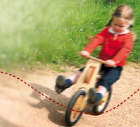 We found this cool little "almost bicycle" while browsing over at Sparkability and liked its look and design. The manufacturer doesn't have the English language section of their website up yet but here's a Babelfish hack/translation of some info:
The LIKEaBIKE are an unique houten bicycle without pedals for children between 2 and 6 years. The design and the technique of the LIKEaBIKE have been exactly coordinated on the motorieke skills and the natural bewegingsdrang of this age group. Spelenderwijs Spelenderwijs the child gets acquainted with its first bicycle, is LIKEaBIKE or too, however, is "almost bicycle"! At its first careful bicycle attempts the child will play ahead pushing and the possibilities firstly with the LIKEaBIKE, to discover Self-confidence Already rapidly discovered the child that it can and it will be run live already sitting on the saddle first mobility. Within very short time balance and manoeuvre and goes it learns the child always more rapidly and more rapidly. The LIKEaBIKE go too fast or threaten he to fall then the child instinctively correct by putting itself both feet on the ground or and this way recover it the control concerning the LIKEaBIKE. Spelenderwijs the child passes through these steps and becomes it within some days an expert in "bicycles". This is tevens a development in feeling of independence.
Link: LIKEaBIKE California
Link: Houtenfiets.nl
Link: Sparkability
Related: Sibi Max (Mocoloco)
Victoria Gardens: suburban mall impersonates a town center in Rancho Cucamonga
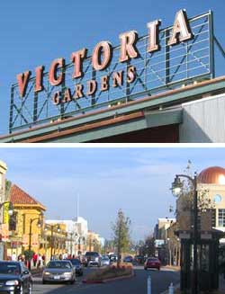 This former agricultural center 50 miles east of Los Angeles was once home to sprawling groves and vineyards, but has been more recently known for the sprawl of big-box mini-malls and cookie cutter tract homes. Now a new development seeks to be the downtown that Rancho Cucamonga, California has never had.
The New York Times saw fit to cover the opening of this new mall, so we figured that it was worth the 40 minute drive to check it out. City planners had originally envisioned a more traditional mall, but the developers had a bold idea that breaks many (though not all) of the rules of the typical mall development. The idea behind Victoria Gardens is not new, pseudo-historic town centers are the core of most New Urbanist neighborhoods, but here it has been inserted into an existing tract home city.
The name of this mall betrays its form; all of the shops are located along an urban grid of streets open to vehicular traffic, complete with parking meters and sidewalks. Parking lots and service areas located in the center of the blocks, much like a traditional American town. "Victoria Gardens" fails to provide a hint of the urban space that has been created, or perhaps this was an intentional move to calm local residents who may fear density.
Link: Victoria Gardens
Article: New York Times -
A Different Sort of Mall for a California Town
Reference: Downtown Mauled - Part II
Developer: Forest City Enterprises with Lewis Retail Centers
Masterplan and Design Concept/Design Architect: Field Paoli
Executive Design Architect: Altoon & Porter
Executive Architect: KA Architects
Design Architect: Elkus Manfredi Architects
Landscape Architect: SWA Group
Not exactly modern, but definitely retro cool.
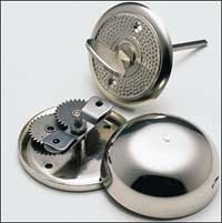 Imagine for a moment that you had one of these retro-cool turnkey doorbells installed in your place. How many people do you think would have no idea how to use it or for that matter, even know what it was? I can see it now, "look at this guy, his deadbolt was installed the wrong way!"
This is really what used to be a corridor bell, as it was originally used for flats in apartment blocks. But the neat bell mechanism, made completely without the use of plastic components, can also be heard in the average-sized family house. The key twist mechanism is designed to fit doors of 6 cm thickness, but can be shortened for thinner doors by cutting the square shaft with a hacksaw. The quality nickel-coated steel plate bell can also be mounted outside.
Link: Manufactum
Via: The Red Ferret Journal
A chair with space for personal things
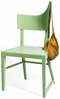 We all know that a chair is more than just a place to sit. It is also a place to set things down, hang your coat and bag, etc. The problem is that there isn’t usually space for anything on the seat once you sit down, your coat usually ends up on the ground, the bag strap won't stay on the chair back, or worse the chair is turned over by the weight.
How about a chair that accepts the reality of its multi-functions? Austrian designers Bruckner/Klamminger/Moritsch have come up with an elegant solution.
Falb is a chair which offers some space to place one's personal things. One stays near it and still has enough room. Its shape differs from the symmetry of usual chairs. Its back carries jackets, [bags], etc. In order to take weight its right chair-leg makes a side-step. It show its individual character.
Link: BKM
Material Reuse
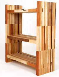 Scrapile is a collaboration between Brooklyn-based designers Carlos Salgado and Bart Bettencourt. Their furniture is created with discarded pieces of wood from local wood shops. According to Carlos Salgado, the idea behind the project was to keep scrap woods from piling up in local land-fills. "We wanted to reintroduce these materials back into our daily lives as useful items and objects" says Carlos.
Link: Scrapile
Link: Bettencourt Woodworking
[Thanks, Carlos!]
NY Times architecture critic Nicolai Ouroussoff reviews the new Caltrans building by Morphosis
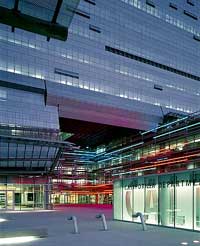 In a review of the new Caltrans District 7 Headquarters building in downtown Los Angeles, Nicolai Ouroussoff touches on some ideas that are pertinent to our earlier posting about "lifestyle centers" and the privatization of public spaces. The building is an important new modern design and the article is worth the read (and browse through the slide show) even if you are not interested in our little diatribe about retail developments.
Like most American cities... [Los Angeles] has had to cope with increasing pressures from developers and urban planners, who tend to see urban space as nothing more than a vast machine for middle-class consumers. In this context Mr. Mayne's revamped Modernism has a refreshing honesty.
Article: NY Times - A Building as a Beacon for a City's Plans
Firm: Morphosis
Reference: Reality Bites (Land+Living)
Off-the-shelf glass and aluminum structure kit house
 We've had a little dryspell in our prefab news, but the drought is over... more prefab for you junkies.
Designed by Los Angeles area architects Linda Taalman and Alan Koch, the concept is a high design, customized (with funky outFiTs) 1000 square foot kit house that takes only 8 weeks to construct. "The iT house is made up of a series of off-the-shelf parts which are internationally distributed by industry partners or locally available as typical standard construction." Two houses have been commissioned and will be build this year.
Link: iT House
Firm: TK Architecture
Zense the Difference
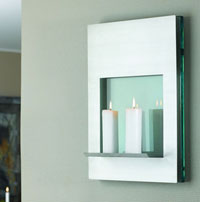 Danish company Zali has a whole collection of matching products designed around glass and stainless steel. That's great if you're into matching all your accesories in sort of an "early 90's Z Gallerie" sort of way but with these accessories, we definitely think moderation is key. Don't overdo it :-) Featured at right is a piece from their Candle Series.
ZALI expresses man’s natural striving for necessary aesthetics. Aesthetics that have actual function and which are also a delight to the eye. A combination of robust, high quality natural materials and the stringent strengths of metals provides a living reflection of expression.
This reflection wanders forever with the changing light – where nothing and everything is new at the same time.
Link: Zali
Blending playful accent pieces with high-style design elements
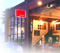 Mixture is a modern and contemporary furnishings store located in San Diego, California. Carrying furniture, lighting, artwork as well as accessories, they feature many hard to find lines that are, occasionally, exclusive to Mixture.
The goal of Mixture is to create a fun, friendly, service-oriented environment that takes the intimidation out of contemporary and modern furniture/gift shopping and feature an ever-changing inventory. Developed to take a young and fresh approach to contemporary design, Mixture exudes a relaxed atmosphere, one that welcomes questions and thrives on educating customers about the intricacies of modern design.
Link: Mixture Designs
Link: Design*Sponge [Thanks, Bryan!]
Eclectic Southern California gardens
 I met Rob Steiner back when he was partners with Jay Griffith... it was an interview actually... and I didn't take the job. But that is another story. I liked Rob's work at the time, and I like it now.
Steiner brings a modern sensibility to his designs which are wonderfully composed and structured architecturally to create outdoor living spaces and extend and/or transform the architecture of the house. He is especially adept in his planting plans which (to borrow from his website since this says it best) "are distinguished for their graphic quality, successional bloom, subtle modulations of tone and year-round foliage interest."
Firm: Rob Steiner Gardens
Year of the Cock.
I was browsing our server logs and noticed quite a bit of traffic coming from a certain Chinese design site. Turns out, they weren't sending us traffic, but instead, simply stealing images. In the past, I hadn't really thought it was that big of a deal, I mean, sure, we are paying for bandwidth and all, and by linking directly to our images, you are consuming our bandwidth, but since it's common for blogs to show their love for other sites with a "Via" link, I never really paid much attention to it.
So then I come across this Chinese site and notice that, while they've got our images, they've also got our text. Except it's in Chinese. And without any "via" or other link thanking us hard-working folks here at L+L for the find. A quick Google translation would reveal that it was translated by someone named "Janel" with an origin of "china-idc". Janel, we're honestly flattered that you found some of the items we've featured likeable enough to put on your site, but not too happy about the way you've gone about it. Since you decided to not give us credit, I decided to (manually, for now) swap out the images with some that do give us credit. In the future, try being like (most) everyone else in the world of design blogs by giving proper credit and hosting the images on your own server. The world will be a much happier place if you do. :-)
Update 4/21/2005: Well, that didn't take too long. Looks like Janel has decided that our "Visit Land+Living" images weren't appropriate for her site so now she's simply linking directly to the manufacturer's site. Hey Janel, what about that Via link I mentioned above? Since you're still using our text, it's only appropriate. And do the same for all the Moco Loco images and text you grabbed as well.
Via (oh, the irony!): China IDC
Landscape installation
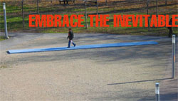 This simple landscape installation deals with the inevitable transformation of designed spaces by the people who inhabit and use them. It speaks to a larger issue in the design world in a way that resonates with us.
Montréal based architect Hal Ingberg (and fellow SCI-Arc alumnus) designed a piece that acknowledges and reinforces the traces of unplanned movements to and from a building at the Université de Montréal.
These traces mark the most natural and firect path of movement to and from the building. However, they have not been designed as part of the building's landscape strategy. Marked by the footprints of numerous building users, they are in effect blemishes, inscribed as corrections to the formalized movement sequence.
We can all personally attest to this non-orthogonal tendency as it pertains to human movement. Historically, it has been employed as an opportunity to inflect richly upon architectural space.
Link: Hal Ingberg
Speakers Panel hosted by Land+Living at CA Boom II Day One
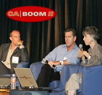 It was a pleasure to host a wonderful panel of landscape design professionals on Friday at the CA Boom Speaker Conference. A thousand thanks to my guests David Fletcher, Tom Leader and Katie Spitz for their time, effort and thoughtful presentations. Many thanks also to Sandra Bartsch and the CA Boom staff who invited me to participate and who worked so hard to produce the speakers series. And a final thank you to all who attended the presentation.
CA Boom had originally planned to provide a podcast of the Speaker Conference, alas some things must fall by the wayside when putting on a large and complicated event with limited resources. Instead we will provide a glimpse of our panel discussion with a few images from each panelist's presentation along with a bit of text to give you a taste of what was covered.
Reference: Breaking Ground: New Directions in Landscape Architecture (L+L)
Montréal Cité Souterraine / Montreal's Underground City - SYN- Urban Exploration Workshop
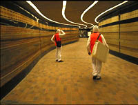 Need a reason to visit Montreal this winter? Montreal's underground city is a good enough one in my books. With its inception in 1966 the plan for the underground coincided with the opening of Montreal's Metro, and has since grown to include 1,500 offices and 1,600 boutiques. It also has numerous art installations, a skating rink, and leads you through historic and newly constructed buildings. For instance, you can go from IM Pei's Place Ville Marie to Claude Cormier's Lipstick Forest in the redesigned Palais des Congress in Old Montreal without ever surfacing.
SYN-, a collective that includes Luc Lévesque, Jean-Maxime Dufresne, Louis-Charles Lasnier and Jean-Francois Prost, have put together a unique study of the underground as part of an Urban Exploration Workshop. It highlights the underground as a viable and exciting intermodal experience. Their Web site includes maps and images.
Link: amarrages prospectus
"At a site where the blast furnace heat was almost unbearable you can now cool down and relax"
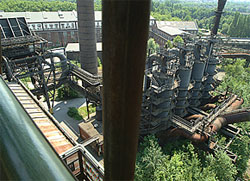 Archinect points us to an article in Stars & Stripes about the Landschaftspark "country park" at Duisburg-Nord in central Germany. We have featured the work of Peter Latz before, as well as a few other post-industrial landscape regeneration projects. The Landschaftspark no doubt inspired projects such as Amsterdam's Westergasfabriek and North Sydney's BP Site Parkland, yet it retains and reuses even more of the industrial infrastructure than either of these more recent projects.
Link: Landschaftspark
Firm: Latz und Partner
Article: Stars & Stripes - Urban decay now a family climbing getaway in Germany
Reference: Latz + Partner (L+L)
Reference: "From Ruin and Artifice, Landscapes Reborn" (L+L)
Reference: Manufactured Sites (L+L)
Super Potato does block 7
 A 'city within a city' is a phrase used in Japan to describe a cluster of buildings connected by industry type, restaurants, recreational facilities and occasionally residences. Shiodome Shiosite is one of Tokyo's newest complexes consisting of skyscrapers that house media giants like Nippon Television and Dentsu Inc., one of the largest advertising agencies in Japan.
The Caretta Shiodome is 51 floors of Dentsu inc. office space, restaurants and bars, museums and retail. However, stop at the 7th floor and find something different: an open concept project called My City designed by the interior design firm Super Potato Co. using 11 materials salvaged from the city to build walls and add texture and detail.
Link: Super Potato
Black and white pinhole photography
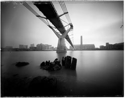 I have tried my hand at pinhole photography, and as simple as the technology is, it takes a mastery of technique to achieve good results. And Rob Gardiner is obviously an all around expert photographer and has made an art of pinhole photography. Rob's explanation of a pinhole camera:
A box with a tiny pinprick-sized hole and a piece of film, it has no lens, no shutter, no cable release, no meter, and no viewfinder.
Rob has a current series of photos following the route of London's Circle Line and features many other wonderful images on his site as well.
Link: Rob Gardiner's nyclondon.com
Via: Things
Omer Arbel Sheds Some New Light
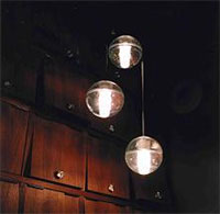 Vancouver designer, Omer Arbel, was recently appointed as Creative Director for Bocci, a new Canadian Manufacturer of high design objects.
Instead of choosing a mid career, established designer for our creative director, we decided to choose someone up and coming who has not yet reached the peak of his career; that way our company can grow and develop along side our creative director’s career. We are getting in on the ground floor, so to speak. Omer Arbel was the perfect fit.
Bocci will inaugurate the new collection with his 14 series cast glass pendants.
The 14 series is a family of low voltage lighting fixtures. The pendants are articulated seamed cast glass spheres with frosted cylindrical voids in them, which house halogen light fixtures. The pendants are designed to be clustered in groups - the effect being of many tiny candles encased in floating spheres of water. The light interacts with the imperfections / bubbles in the glass to make a visually rich halo of light around the piece.
Link: bocci
Bean Bags for the 21st century
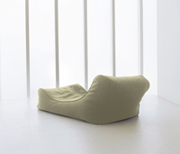 Ambient Lounge has redefined bean bags for an upscale urban market that wants style that is casual and sleek.
The new online retailer Ambient Lounge has revolutionised the bean
bag market in the UK and Europe by introducing new shapes that are not only
quantum improvements in comfort and function, but reflective of the modern
style, colours and tastes of home wares today. Rather than being an
embarrassing luxury shoved into the cupboard when guests come around,
Ambient Lounge bean bags are now a centerpiece of style & quality in many
people’s living rooms. With the outstanding new designer range developed by
their interior design team, this is set to accelerate exponentially into
2006 and beyond, both in the UK and ‘style driven’ European markets such as
France, Germany, Italy, Spain and Sweden.
Link Ambient Lounge
An urban Dublin neighborhood school / Seeing Éire [I.5]
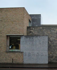 Back to Ireland as promised, and a month after my last post in the Seeing Éire series no less. Here we will take a closer look at one building in Dublin by O'Donnell + Tuomey Architects, a building which made an impression on me nearly eight years ago and which took my two visits to Dublin to finally see in person.
Set in the Georgian south Dublin neighborhood at Mountpleasant Square, the design for this school responds equally to site, program and context. The concept interweaves a series of internal and external spaces in response to program requirements connected by a linear spine. Spaces interlock to make one block which provides a strong edge and presence to the busy street to the north, while the south facade presents a softer face with a verandah opening outwards to a sunken playground/garden on the south of the building in deference to the adjacent residential terraces. Salvaged brick and stone create the perimeter shell while wood cladding and detailing defines the more interior facing spaces.
Firm: O'Donnell + Tuomey Architects
Link: Archeire - O'Donnell + Tuomey Architects win RIAI Gold
Article: RIBA Journal, December 1998, Volume 105, No 12 - Lesson Plan
See it: Google Maps Ranelagh Road at Mountpleasant Road & Old Mountpleasant
Reference: Seeing Éire [prologue] (L+L)
Reference: Seeing Éire [I] - Ailtireacht na Baile Átha Cliath (L+L)
Reference: RIAI Awards 2005 (L+L)
BO BEDRE Element 2005 competition
 If you had only eight days to design a piece of furniture how well do you think you'd do? The young designers who took up the challenge to do just that did fairly well at the Danish magazine BO BEDRE Element 2005 competition.
The criteria for competition was a maximum of five years of design experience, being under 35 and having eight days to produce a finished product. Seven designers took the challenge and their work is currently on display at the Danish Design Centre until December 30, 2005.
Link: DDC Release: Element 2005
A free book that shows how to attain Platinum LEED on a conventional budget
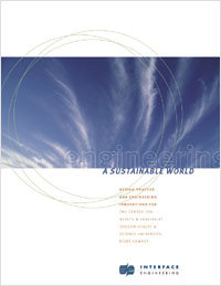 Portland based Interface Engineering has published an illustrated guide demonstrating how to achieve Platinum-LEED on conventional building budget in a FREE 48-page book which uses their current project for Oregon Health and Science University as a case study.
Busting a key economic myth, Interface Engineering of Portland, Oregon (has) engineered a top-level green building on a conventional budget, opening the way for other large scale projects to achieve high performance at standard cost. The firm also released an illustrated guide sharing the secrets and principles behind the project, formally known as The Center for Health and Healing at the River Campus of Oregon Health & Science University.
Link: Green Building Breakthrough
Via: Groovy Green - Green Building: Delivering Champagne on a Beer Budget
Center for Health and Healing project team:
Architect: GBD Architects
Engineer: Interface Engineering
...make 'em be landscape architects and librarians and such
 An article by Marty Nemko in U.S.News & World Report lays out a list of the "most–and least–rewarding careers" for 2006 in four categories: excellent, good, fair and poor. Architecture lands in the "fair" category, while landscape architecture is placed as an "excellent" career choice.
Architecture:
Many outsiders think this is a terrific, artistic career, but they don't realize how long it takes before an architect gets to design a building.
Landscape Architecture:
Because most landscape architecture projects don't have as many components as the design for a building, young landscape architects may get to design entire projects. Also, the training is shorter.
Read. Digest. Vent.
Article: U.S.News & World Report - Most–and least–rewarding careers
Graphic representation of HTML structure
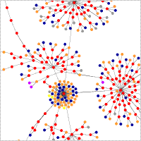 Here is an interesting way to look at the underlying code structure of a website. German blogger Ahref has written an app that graphically charts the hierarchy of a website's HTML tags. Shown on his site are graphs of many well known websites such as Google, CNN, Apple, etc.... pretty cool.
Link: Aharef
Link: See L+L unfurl
Link: Graph your own website!
Via: Coudal